
Graphic Design
& Typography

My graphic design work is bold yet thoughtful, using contrast, warm palettes, and strategic desaturation for impact. I build depth with repetition, structured grids, and clear hierarchy. My designs combine fluid and precise lines, geometric forms, and rich textures inspired by East Asian art. I apply these principles to make education more engaging and accessible, embodying an authentic and intrepid artistic vision in every project.
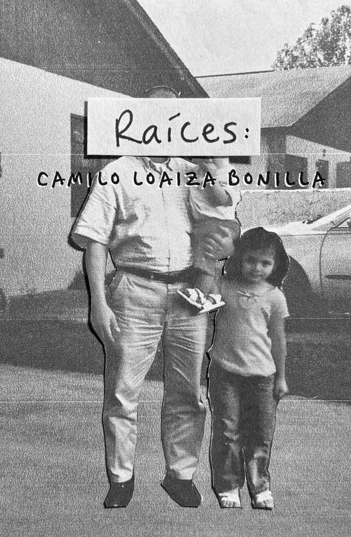
Raíces & Roots Exhibition Catalog
I had the pleasure of designing the visual identity for Raíces/Roots, a solo exhibition by artist Camilo Loaiza Bonilla at the University of Tampa. My goal was to create a design that felt as layered as the work itself, which explored themes like queer identity and family history through video poems and digital visuals. I thoughtfully chose a typographic style and layout that would bridge the gap between the "digital" and "analog" subjects in the exhibit while staying within the client’s printing budget. The final layout captured the exhibition's soulful, experimental energy and ensured the promotional materials felt cohesive and inviting for the gallery's visitors.
This print was additionally published by the University of Tampa and exists now within its library archive.
Graphic Design Capstone
My BFA Capstone, Shifting Optics & Changing Perspectives, explores the powerful role of graphic design in public education, specifically addressing misinformation and promoting accurate knowledge within the field of eye care. This project culminated in an interactive exhibition and comprehensive accompanying materials, showcasing how strategic design can transform complex information into accessible and engaging experiences.
-
My capstone leveraged graphic design to combat eye care misinformation. Through an interactive installation and catalog, I demonstrated design's role in disseminating accurate information, demystifying vision myths, and promoting eye health, empowering individuals with accessible, engaging educational content.
-
The development of this showcase was a rigorous, multi-faceted process rooted in extensive research and iterative design. It began with identifying a critical problem: the pervasive misunderstanding of eye care. This led to in-depth research and ideation, including a comparative analysis of medical museums and user research through interviews with optometrists, opticians, and medical communication professionals, alongside public questionnaires. This phase informed the project's core goals: to create an educational exhibit and catalog that would serve as a case study for graphic design's role in public health communication.
Concept development involved sketching initial designs for an interactive exhibit featuring a grid of panels, each addressing a specific eye care topic or myth. This included designing a take-away trifold to extend the educational experience beyond the physical space. The final project and gallery exhibition phase brought these concepts to life, culminating in a large-scale installation with interactive elements, detailed exhibition panels, and a comprehensive process book. My role encompassed everything from the overall concept and print design to the meticulous typesetting and visual execution, ensuring that complex medical information was translated into clear, engaging, and visually compelling content. This entire journey underscored my commitment to using design to foster positive change and educate communities.
-
My BFA Capstone was an interactive exhibition demystifying eye care and combating misinformation, shaped by my museum and optical background. Featuring educational panels, an interactive station, and a trifold, it transformed complex medical information into accessible content. My roles at The University of Tampa's Scarfone/Hartley Gallery and The Florida Museum of Photographic Arts provided vital experience in exhibition design, print production, and visitor engagement, directly informing this impactful educational installation.
Zooming Superheroes from Dyes to DPI:
The Visual and Technical Evolution of Comic Book Printing
Zooming Superheroes from Dyes to DPI: The Visual and Technical Evolution of Comic Book Printing is an exhibition I led in visual design at the Scarfone/Hartley Gallery. The exhibit explored the fascinating history and technical advancements of comic book printing. Through an interactive layout, the exhibition guides visitors through the evolution of visual storytelling in comics, highlighting significant shifts in color printing technologies and engaging them in the creative processes behind their favorite superhero narratives.

-
As the Graphic Designer for Zooming Superheroes from Dyes to DPI: The Visual and Technical Evolution of Comic Book Printing, I crafted an immersive and highly effective exhibition design. My work encompassed developing compelling and consistent visuals identity, and contributing to the overall layout, which successfully guided visitors through two distinct, yet interconnected, narratives: the historical journey of comic books and the profound evolution of color printing technologies. The design facilitated an engaging and interactive experience, featuring hands-on activity stations that allowed visitors to actively explore the creative and technical processes behind comic book production, ultimately enriching their understanding of this dynamic art form.
Exhibition Photography (Update Coming Soon)
-
Due to the inability to create an official catalog for the exhibition, as the source material is copyrighted and owned by multiple entities, the Director of the Scarfone/Hartley Gallery made a special request for one to be crafted for her personal collection. I was tasked with developing a visually engaging and well-organized companion piece that enhances the visitor experience. My design approach focused on offering an intuitive and immersive exploration of over 90 years of comic book history, organized into clearly defined sections that outline different "ages" and "methods of comic creation." From the moment readers see the striking cover collage of iconic comic book artwork, they are drawn into the lively universe of superheroes. The interior design further enriches the content with a clearly structured table of contents, thoughtful typography, and the seamless blend of historical images and detailed technical illustrations. Every aspect, from the layout of each page to the selection of color schemes, was meticulously planned to ensure clarity, readability, and a captivating visual narrative, effectively supporting the exhibition's examination of the intriguing evolution of comic book printing.
Neon Vol. 47
As the Art Director for Neon: Literary & Art Magazine, a distinguished student-run publication at the University of Tampa, I led the comprehensive design and production of our annual volume. My responsibilities encompassed all aspects of visual content, including strategic typesetting, compelling layout design, and original illustrations.
This year, I am proud to have overseen the publication of the largest volume in the magazine's history, facilitated an event with the Tampa Museum of Art, and achieved record distribution figures upon launch. Furthermore, my own artistic and written contributions were selected for inclusion through a rigorous, anonymous peer-review process, underscoring the quality and impact of my creative work within the magazine. This collaborative effort consistently showcases exceptional work from undergraduate, postgraduate, and Tampa Bay area contributors.
-
Neon: Literary & Art Magazine, Volume 47, showcases significant design strengths. As the designer, I ensured the cover's bold typography and striking colors set a contemporary tone. Throughout the volume, I maintained a cohesive and professional aesthetic through thoughtful typesetting, balanced integration of diverse works, and strategic use of negative space. This meticulous attention to layout and visual harmony transforms individual submissions into a unified and engaging reader experience, underscoring a high standard of publication design.
-
Neon's promotional materials feature dynamic, cohesive design. Its bold, vibrant logo and contrasting colors create a modern, energetic identity. Diverse imagery and clean layouts, with playful elements, effectively convey event details and the magazine's creative spirit.
View the Designs:
Eyewear Product Design
Blending Design and Optics
As a graphic designer focused on publication, web, and fine art—including mold-making, sculpture, painting, and textiles—I aimed to leverage design to explore the transformative changes I observed in the industry that fostered positive advancements. This independent study explores eyewear design, a unique intersection of my graphic design skills and experience as an ABO-certified apprentice optician at Warby Parker. In Spring 2024, I collaborated with sculptor and University of Tampa Associate Professor Kendra Frorup. We aimed to explore the history of eyewear, innovative materials, and potential improvements to contemporary designs.
Summary: From Research to Resin Frames
The study began with an in-depth inquiry into eyewear history, from 9th-century "reading stones" to modern designs. Researching Warby Parker's brand guidelines, I applied similar design values, drawing inspiration from local environments. Each frame was named to capture a unique personal style. A significant focus was on exploring sustainable eyewear materials. Due to time constraints, I used vegetal resin (a plant-based bioplastic) for my frames instead of cellulose acetate, allowing for a comparative study.
I created 20 unique frame designs, gathering coworker insights on features and styles. Using Fusion 360, I developed 3D models, then 3D printed prototypes, made reusable silicone molds, and cast ten designs with plant-based resin. Subtle modifications to hinges and resin layering mimicked mixed-material frames. This project deepened my appreciation for optics and reinforced my interest in educating future opticians.


A Tale Through Type
This virtual exhibit, A Tale Through The Centuries of Type, is a project I designed to showcase the comprehensive history and evolution of typography. I've covered everything from ancient forms like cuneiform tablets and woodblock prints to the integration of modern digital typography. My aim was to delve into the communicative function of typography and its accessibility both before and after the introduction of mass printing techniques, such as the Gutenberg press. Through this exhibit, I explore the significant technological developments in type design across various historical periods. The wordmark and bases for this exhibit are based on theoretical collaboration with the Metropolitan Museum of Art.

-
The UX design, featuring a structured sitemap and wireframes developed through an iterative process, ensures clear navigation and an intuitive flow. This systematic approach effectively guides users through the exhibit's comprehensive history of typography, fostering an engaging and educational "Explore The Exhibit" journey. Thoughtful elements, like the Met-inspired wordmark and use of chronological structure, further enhance the overall aesthetic and contribute to a cohesive, high-quality user experience that supports the exhibit's educational goals.
-
The assets in this UX project are diverse and historically rich, featuring high-quality visual representations of typography's evolution, including cuneiform tablets, woodblock prints, illuminated manuscripts, and early prints. Each historical piece is meticulously detailed with its date and materials, such as a clay tablet from c. 3500 BCE and a Qur'an manuscript utilizing ink and gold on parchment. The presentation quality is professional and refined, characterized by a structured sitemap and detailed wireframes that guided the design process. Iterative critiques and wordmark development demonstrate a commitment to visual excellence and a seamless user journey, ensuring the complex historical narrative is both engaging and clearly presented.
Barneys New York Rebrand
This project represents my comprehensive rebrand of Barneys New York, focusing on revitalizing its iconic luxury identity for a modern audience. I developed a detailed brand style guide, including updated logo, typography, and a refined color palette, ensuring a sophisticated and cohesive visual language. Simultaneously, I redesigned the user experience and interface, creating a new website and app prototype that emphasizes personalized shopping, exclusive services like personal styling and tailoring, and a seamless, intuitive journey for the discerning customer. My goal was to blend Barney’s classic elegance with innovative digital features, ensuring (if returned) it remains a premier destination in the luxury retail space.

-
My research into Barneys New York's branding revealed a sophisticated and luxurious aesthetic, characterized by a minimalist logo, high-quality imagery, and a refined color palette. The brand messaging emphasized luxury, exclusivity, curated experiences, and innovation. Customers particularly appreciated Barneys' curated selection, the luxurious in-store experience, exceptional customer service, and unique collaborations. Based on this, my research identified key areas for future enhancement, including an enhanced omnichannel experience, a stronger focus on sustainability, continued exclusive collaborations, experiential retail initiatives, and increased community engagement.
-
My brand guide for the Barneys New York rebrand is a comprehensive and high-quality document, meticulously crafted to define and maintain the brand's revitalized identity. It thoroughly outlines the refined logo, a carefully selected typography system (including both English and Japanese fonts for expanded reach), and a sophisticated color palette that beautifully balances a timeless black and white foundation with vibrant, modern accents. This level of detail and strategic consideration ensures consistency across all brand touchpoints, reflecting a "New Vision. Yet Always Classic" approach. In comparison to many other company brand guides, its depth in articulating visual and linguistic elements, combined with a clear mission to redefine luxury retail, positions it as a robust and exemplary standard for effective brand governance.
-
The designs, including a redesigned website and app, prioritize intuitive navigation and a visually sophisticated aesthetic that aligns with the brand's high-end positioning. My work emphasizes personalized experiences, integrating features like a main landing page, detailed product pages, and dedicated sections for services such as personal stylists and tailoring.